2017 Wedding Colours
What pulls in all of the elements of your wedding better than the colour scheme? While certain classic wedding colour trends continue year after year (think blush, all-white, and metallics) the specific tones change with each season. Here is a rundown on which colours are making the mark for 2017, and how they can be incorporated into the most notable elements of your wedding day!
Colour of the Year - Greenery
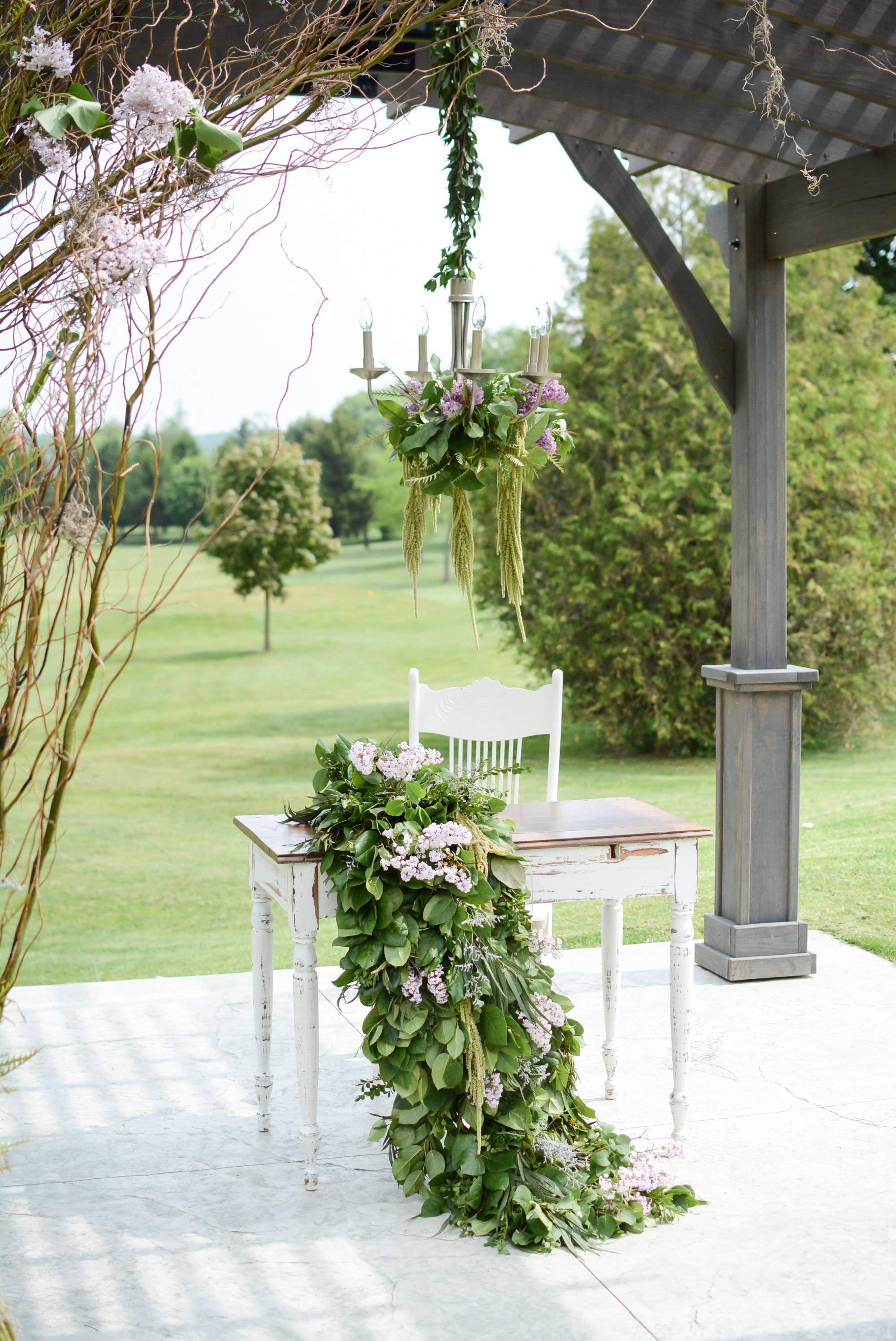
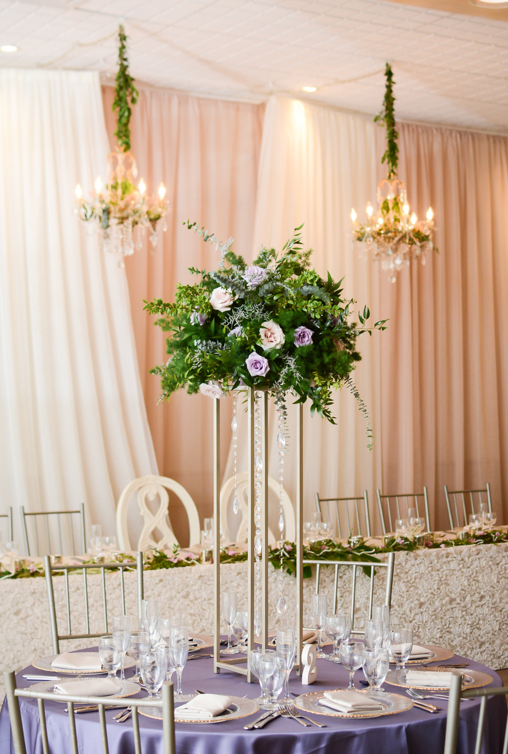
We saw the concept of greenery starting to take flight in the 2016 wedding season. Now, with the shade 'Greenery' being Pantone Color Institute’s Color of the Year, 2017 brides are choosing to have greenery run through every part of their wedding colour and decor scheme - from centerpieces, table garlands, greenery-dripped chandeliers, to full greenery walls behind their Head Table or photo booth. Refreshing pops of green help to incorporate nature and the outdoors into the wedding decor and overall feel, even for indoor venues. Greenery symbolizes freshness and a new beginning, which are perfect elements to the start of a new life together.
(Below): Greenery garlands, chandeliers and raised centerpieces in the St. Marys Ballroom and ceremony pergolas. Photography by Nina Polidoro.
There are many ways to incorporate shades of green into your wedding colour palette. The type of venue you choose will often provide inspiration about what palette to work with. Deciding on a venue that's already surrounded by nature and greenery will help you easily achieve this look on your wedding day.
Moreover, the season of your wedding will be another deciding factor. If you are getting married spring through fall, and have the option of an outdoor ceremony, greenery will naturally mesh with the existing setting, and can be added to your arbour or pergola (as pictured above) and pew markers, for additional impact. Popular varieties of greens to consider are silver dollar or seeded eucalyptus, dusty miller, salal, and variegated pit. If you're tying the knot in the colder months, winter greens like pine, cedar, balsam, and magnolia leaves are full and fragrant, and also relatively inexpensive in comparison to other types of arrangements.
In addition, consider incorporating the colour green in more unique and bold ways. Bridesmaid dresses in the shade of sage, or vintage couches for your photo booth upholstered in forest green velvet. And don't forget about the beautiful, naturally-glamorous and timeless trend of adding greenery into your own bridal look or that of your bridesmaids - think greenery crowns or hair pins, bouquets and corsages.
Greenery hair crown and bridal bouquet.
Floral and greenery bridesmaid bouquets by Lyric Flowers. Photography: Erin Leydon. Venue: St. Marys Golf & Country Club.
Bold Colour Palettes
Bright and vibrant colours are a fresh way to accent a neutral wedding colour scheme, or if you prefer to be bold, these tones can act beautifully as your primary palette. Traditional brights such as fuchsia, coral and orange represent fresh spring and summer vibes. For late summer and fall weddings, ever-classic shades like deep reds, plum, and dusty rose compliment navy blue and subdued greys beautifully, or are bold all on their own. Rather than choosing many different tones, sticking with one or two strong colours, or choosing several shades in the same colour family can help create a more refined and sophisticated colour combination that avoids detracting from your other decor.
Bold cranberry red florals beautifully compliment blush tones, greenery, and navy accents. Photography: Kate Romenesko. Design: Kate Weinstein of Le Bash. Photo Source: Wedding Chicks
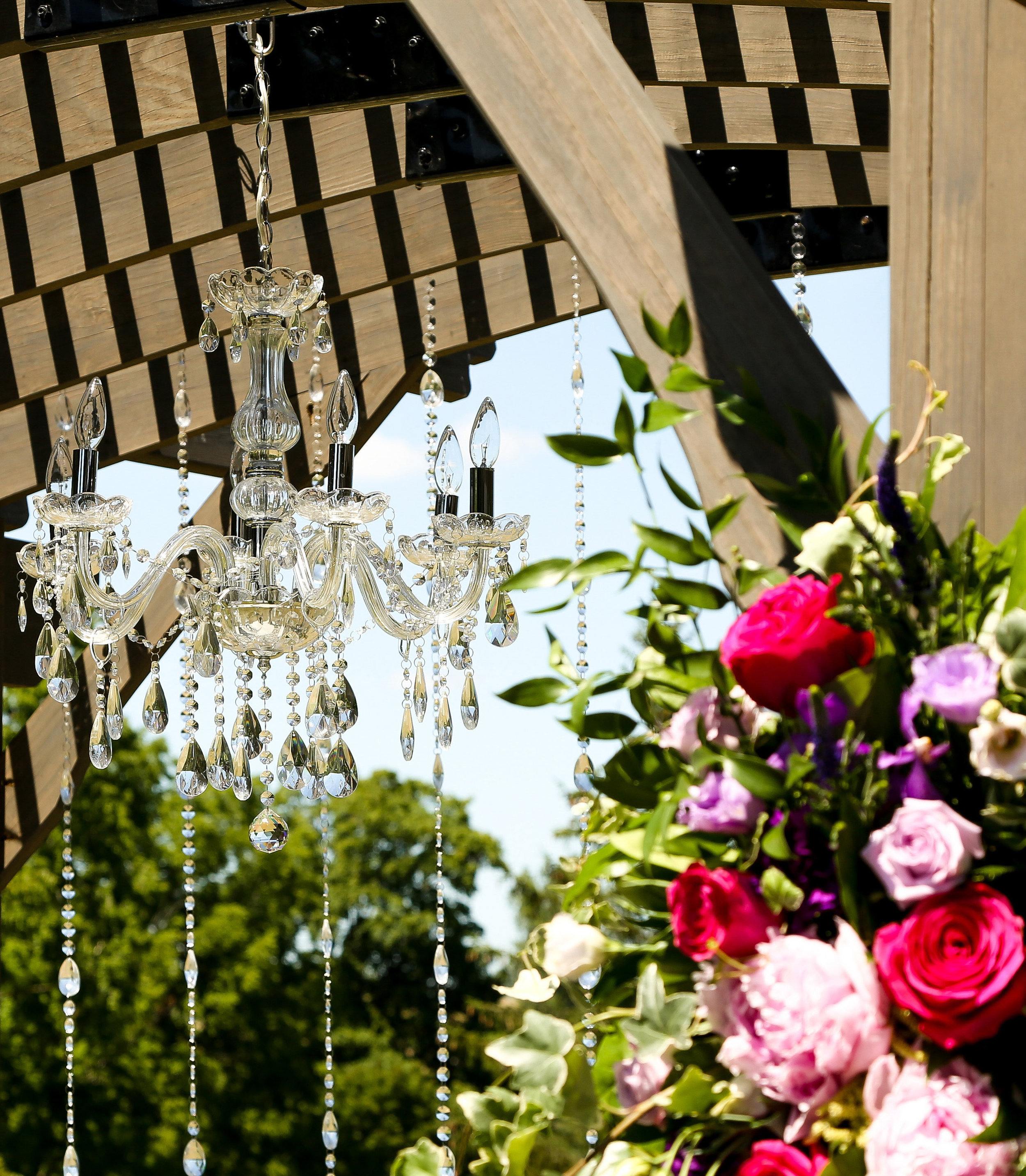
Your ceremony setting and wedding cake are important elements of your day where vibrant colours can really pop. For your cake, have your Florist or Baker add pockets of floral to compliment the neutral icing, and bring your colour scheme into cake cutting photos (as pictured below). For your ceremony, ask your Florist to create colourful floral arrangements that will take center stage in photos - that is, next to the two of you! Keep in mind that bright colours don’t necessarily have to be tied into every part of your wedding; however, carrying the colour palette throughout the important (and photographed) elements can create a seamless and magazine-worthy effect.
Looking to the venue for inspiration can help you tie in tones that are already being used, or compliment the base tones of the space. Art, flooring, ceiling features, or other permanent aspects of a venue will have an effect on your colour palette. It can be helpful to have an idea of your colour selections before visiting venues, as this will help with deciding whether certain elements you've chosen might mesh or clash. On the flip side, choosing a venue with a neutral backbone (such as a room with champagne tones, like the St. Marys Ballroom) is a smart place to start, as any colour scheme you choose will be suitable. Neutral spaces allow for you to add pops of colour with dramatic up-lighting, which will have a huge impact on the overall feel of your wedding, and really help you express your bright colour choices (as pictured below).
St. Marys Ballroom wedding dramatically-decorated with layers of fabrics, flowers and lighting in fuchsia. Decor: Devine Wedding Design.
Black is Back
Black has been a tried and true way to elevate the sophistication of wedding elements; from the invitations, to the decor, to the wedding party attire. Aside from classic black table linens, we'll see this dramatic shade used in many new ways this season, such as black charger plates, candles, striped table runners, and even full backdrops. To keep the look from being too gothic, consider balancing with more traditionally feminine elements like cream or champagne linen choices, chairs uphostered in light-coloured fabrics, and choosing florals in brighter tones. Flower varieties like the anemone are a perfect mix of light and dark all on their own, as this is a delicate white bloom with a navy blue center.
Black charger plates, pillar candles, and centerpiece bases bring a moody and romantic feel to weddings. Photo Source: Green Wedding Shoes.
Often, black is a colour choice that pertains to the wedding party and groom style as well. Many 2017 brides are choosing black (or another deep shade like navy) for their bridesmaids' dresses, and opting for their groom and groomsmen to wear black tuxes - both of which are extremely timeless. With darker attire, you may choose to contrast with classy white floral, or use bold accent colours in the bouquets and accessories to make a statement. Using pops of colour or a metallic can add a modern and fresh feel to this moody colour palette. Champagne gold, rose gold, bronze, and copper are being shown in wedding publications as accent colours for calligraphy on invitations, wording installations on backdrops, and wedding cake toppers.
Rose gold, pink and white accents add punch to a dramatic black backdrop. Event Design, Florals, Rentals, and Photography: The Perfect Palette.
There is a colour palette to suit everyone for 2017 weddings. Where did you get the inspiration for your wedding colours? Are there any unique elements that you'll be incorporating your colours into? Let us know in the comments!


